Here I will demonstrate the basic application of smart watch, the "time" function.
The watches people currently wear did fulfil its basic responsibility of displaying time, some have stopwatch and timer function. Only for those prestigious watches may have compass and GPS built in. For the same reason, the price of those watches are expensive - due to the internal complexity and the difficulty of inserting a compass system. The smart watch is capable of both function with a lower cost - the physical compass system is no longer needed and it is replaced by magnetometer. Also, smart watch is able to change its watch face to enable a wide range of personality of the watch, and display the time elegantly.
The watches people currently wear did fulfil its basic responsibility of displaying time, some have stopwatch and timer function. Only for those prestigious watches may have compass and GPS built in. For the same reason, the price of those watches are expensive - due to the internal complexity and the difficulty of inserting a compass system. The smart watch is capable of both function with a lower cost - the physical compass system is no longer needed and it is replaced by magnetometer. Also, smart watch is able to change its watch face to enable a wide range of personality of the watch, and display the time elegantly.
 | 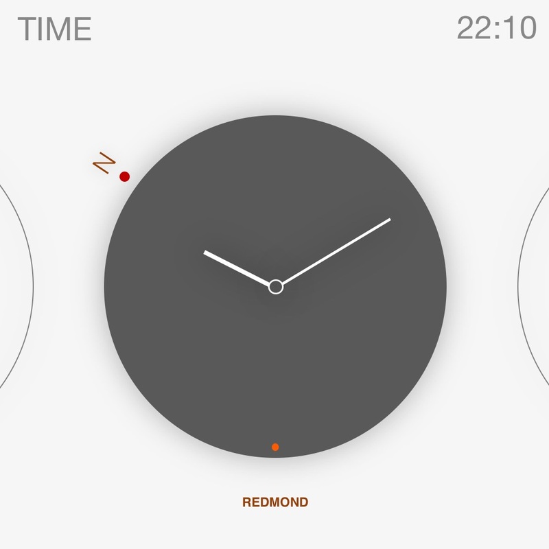 |
Here I took a minimalistic approach to design the watch face. There are no complicated dashboard and wheel, no background images and other information. It tells one thing that people want to know - the time. However, as you can see, there are some tweaks in the UI. The colour difference of the watch indicates the day/night difference, and the second hand is represented by a red dot. Then, the red dot with a "N" indicates the compass orientation as people usually track their time together with orientation, therefore, I put it together and blend it harmoniously. In terms of navigation, user will swipe left or right to check the world time and swipe up or down to change to stop watch or timer function.
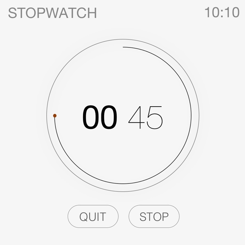 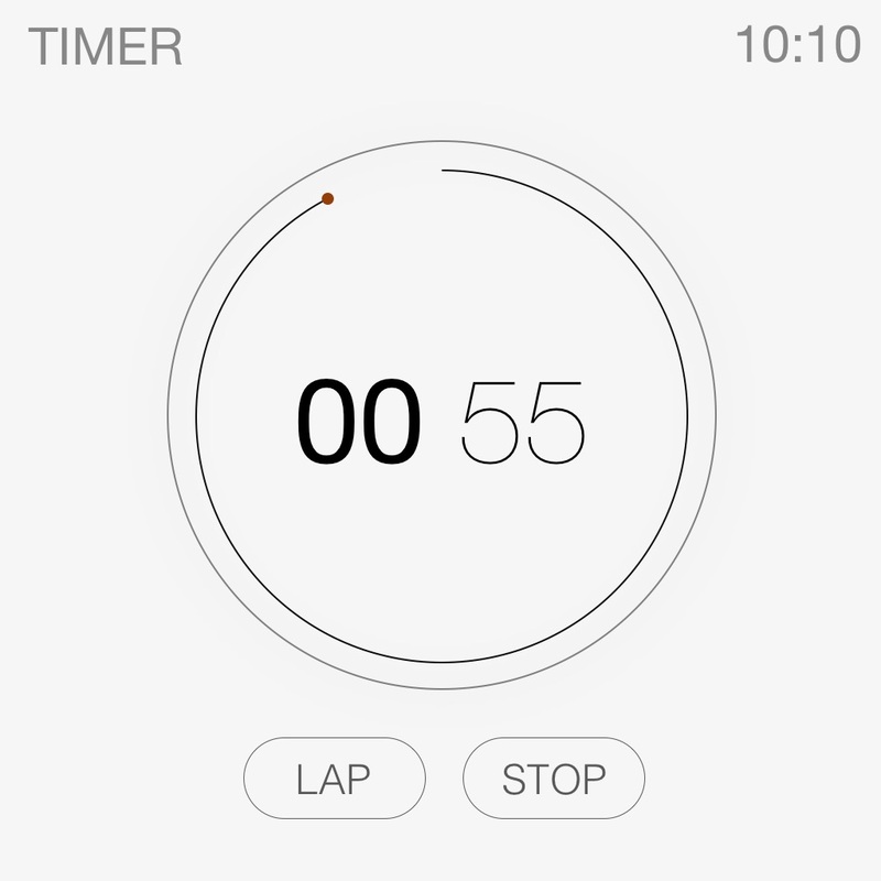 | 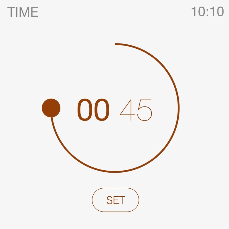 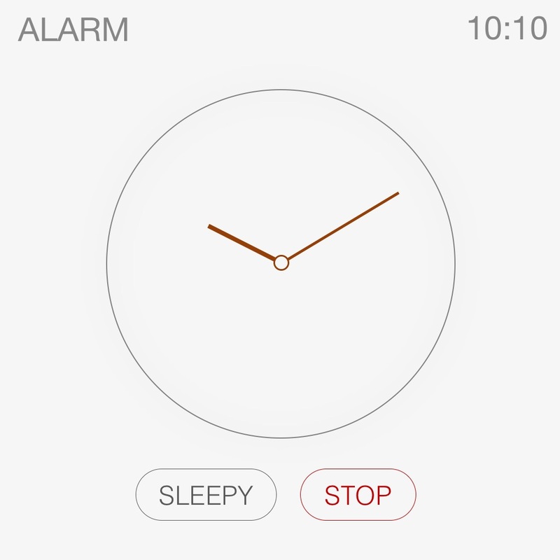 |
Stopwatch and timer are basic functions as a watch. The UI here continue to use the simplified design.The number in the middle indicate the time left or the time spent. The second hand is still present as a red dot, but leaving a black tracking line. When editing a time, it will be coloured red and the red dot is enlarged for hand adjustment.
Come and explore the first part of the watch UI: http://lutio.weebly.com/blog/my-conceptual-design-of-smart-watch-interface-part-i
The watch UI here emphasise a sense of harmony. The fonts and the lines are organically blend together and some part will automatically turned into actionable button. It is all integrated and related to each other and that's the essence of these design concepts.
This watch UI is still in development and I hope to improve it over time. Please give me suggestions and recommendations. Thank you.
