  | MATERIAL DESIGN is a design language developed by Google and announced at the Google I/O conference on June 25, 2014. Expanding upon the "card" motifs first seen in Google Now, it is a design with increased use of grid-based layouts, responsive animations and transitions, padding, and depth effects such as lighting and shadows. "Unlike real paper, our digital material can expand and reform intelligently. Material has physical surfaces and edges. Seams and shadows provide meaning about what you can touch." Designer Matías Duarte Google states that their new design language is based on paper and ink. |
GOALS OF MATERIAL DESIGN
1. Create a design standard language that synthesises classic principles of reasonable design with the innovation and possibility of technology and science.
2. Develop a single underlying design that enables a unified flexibility across platforms and screen sizes. Mobile precepts are fundamental, but touch, voice, mouse, and keyboard are all first-class input methods.
PRINCIPLE OF MATERIAL DESIGN
 Material is the metaphor The material is grounded in tactile reality, which is inspired by the study of paper and ink, yet technologically advanced and open to imagination and magic. Surfaces of the material provide cues that are grounded in reality. The use of familiar tactile attributes helps users quickly understand interaction. Yet the flexibility of the material creates new interaction that supercede those in the physical world, without breaking the rules of physics. The fundamentals of light, surface, and movement are key to conveying how objects move, interact, and in relation to each other. Realistic lighting shows seams, divides space, and indicates moving parts. | 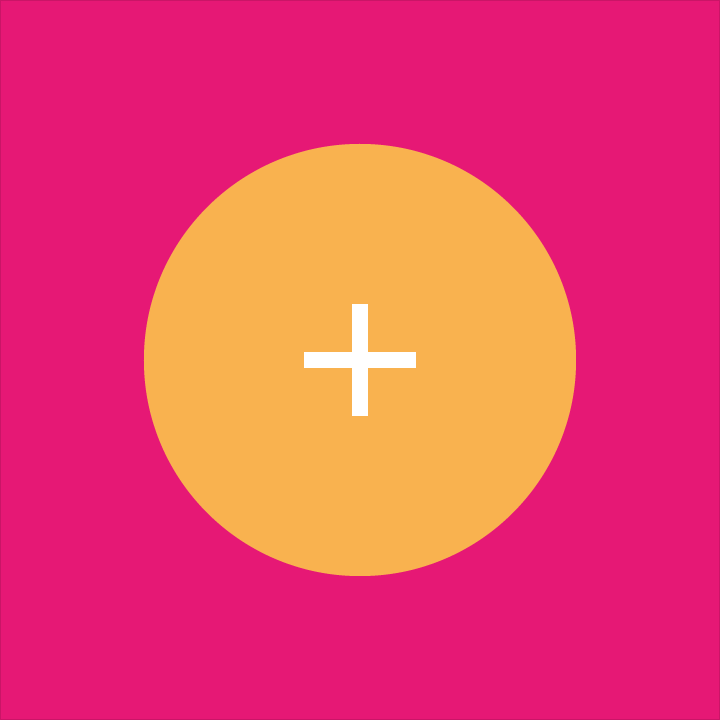 Bold, graphic, intentional The foundational elements of print-based design—typography, grids, space, scale, color, and use of imagery—guide visual treatments. These elements do far more than please the eye. They create hierarchy, meaning, and focus. Deliberate color choices, edge-to-edge imagery, large-scale typography, and intentional white space create a bold and graphic interface that immerse the user in the experience. An emphasis on user actions makes core functionality immediately apparent and provides waypoints for the user. | 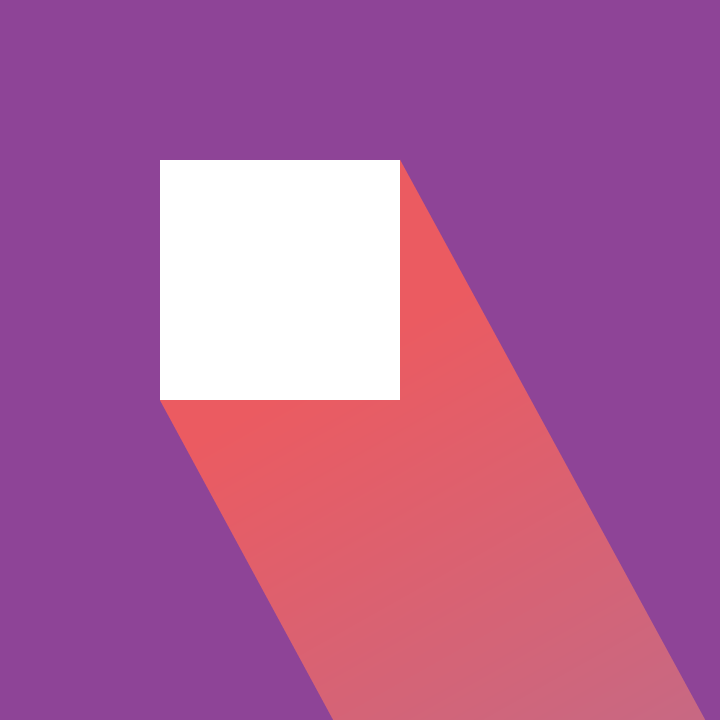 Motion provides meaning Motion respects and reinforces the user as the prime mover. Primary user actions are inflection points that initiate motion, transforming the whole design. All action takes place in a single environment. Objects are presented to the user without breaking the continuity of experience even as they transform and reorganize. Motion is meaningful and appropriate, serving to focus attention and maintain continuity. Feedback is subtle yet clear. Transitions are efficient yet coherent. |
ELEMENT OF MATERIAL DESIGN
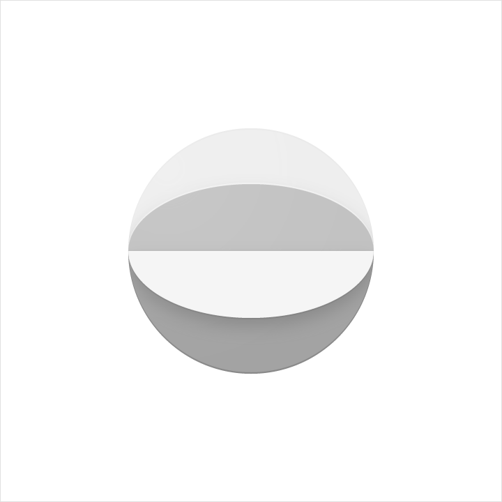
LIGHT AND SHADOW
Within the material environment, virtual lights illuminate the scene and allow objects to cast shadows. A key light creates directional shadows, while an ambient light creates consistent, soft shadows from all angles.
All shadows in the material environment are cast by these two light sources. Shadows are the absence of light resulting from the occlusion of these light sources by sheets of material at various positions along the z-axis.
 Shadow with key light |  Shadow with ambient light |  Shadow with both lights |
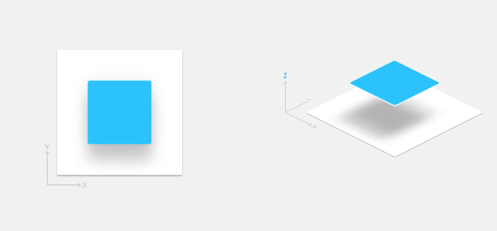
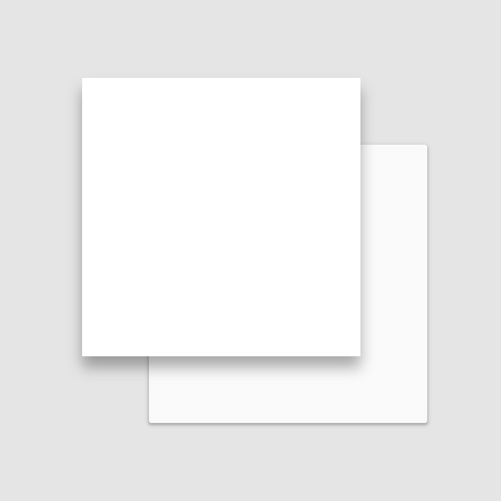
Material casts shadows. Shadows result naturally from the relative elevation (z-position) between material elements.
MULTIPLE OBJECTS
Input events cannot pass through material.
Input events cannot pass through material.
 DO | 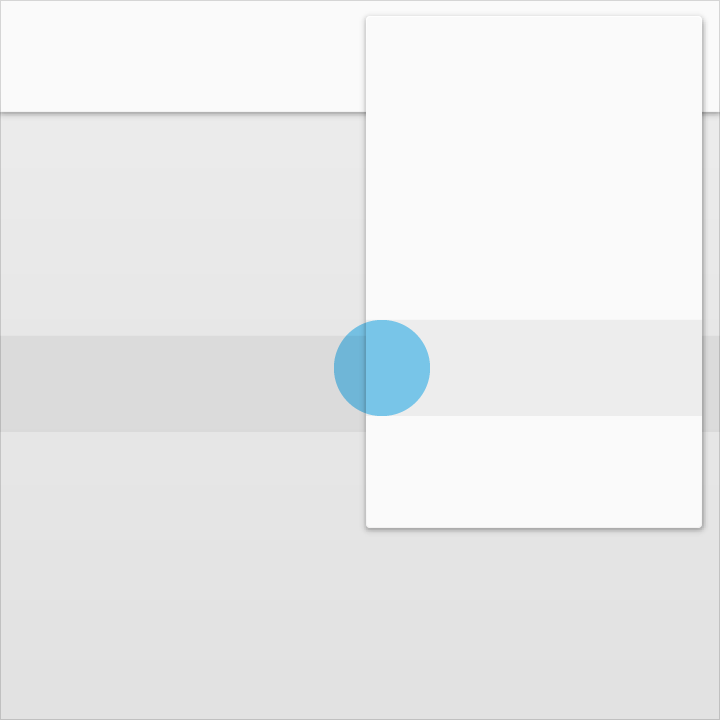 DON'T |
Multiple material elements cannot occupy the same layer simultaneously.
 DO | 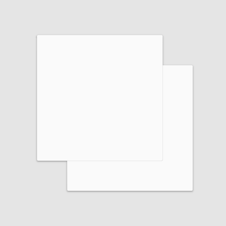 DON'T |
Material cannot pass through other material.
For example, one sheet of material cannot pass through another sheet of material when changing elevation.
For example, one sheet of material cannot pass through another sheet of material when changing elevation.
DON'T
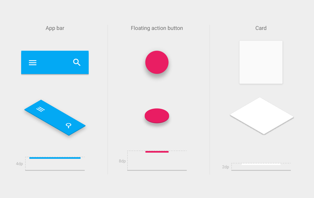
ELEVATION
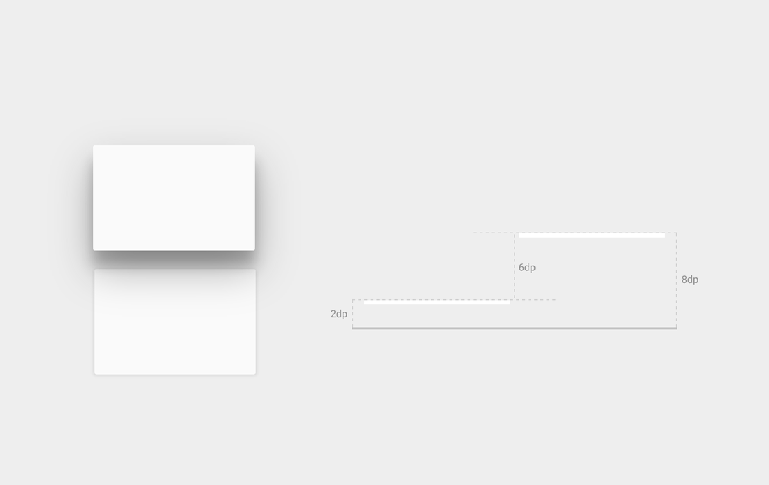
Elevation is the relative position of an object along its parent’s z-axis. Elevation is the relative value between parent and child objects.
Elevation is measured in the same units as the x and y axes, typically in density independent pixels (dps). Since material has a standard 1dp thickness, all elevation distances are measured from one top surface to another top surface.
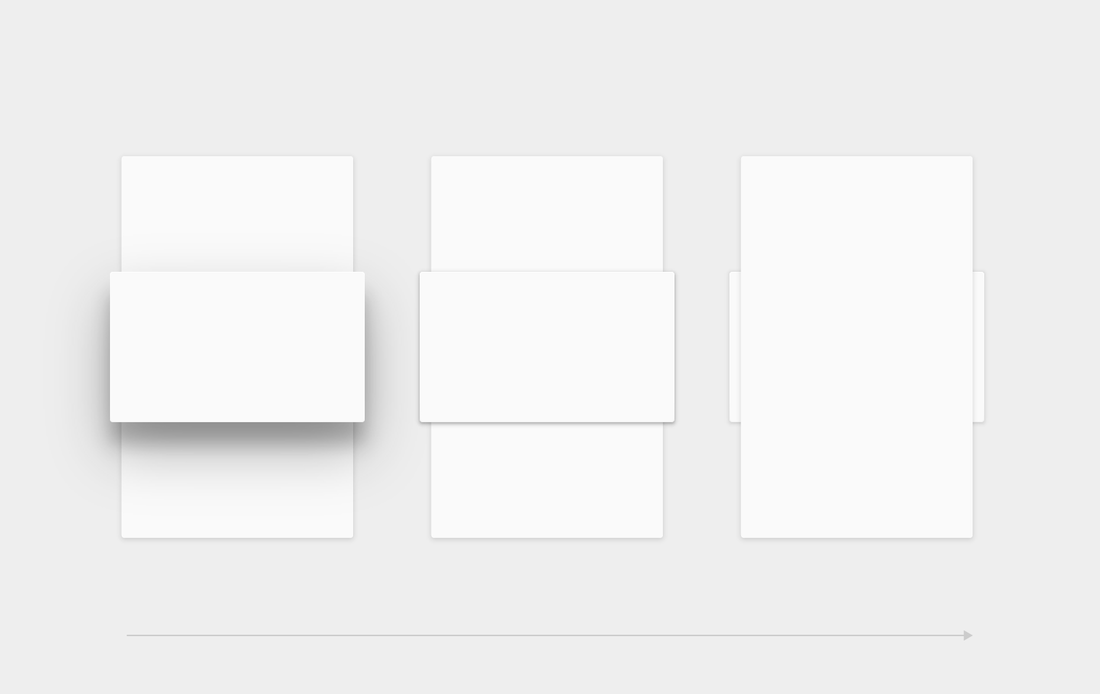
All material objects have a resting elevation, whether the object is a small component or a sheet that spans the entire display.
Examples of some resting elevations
In the static state, the resting elevation for an object does not change. It is constant throughout an app. If an object changes elevation, it should return to its resting elevation as soon as possible.
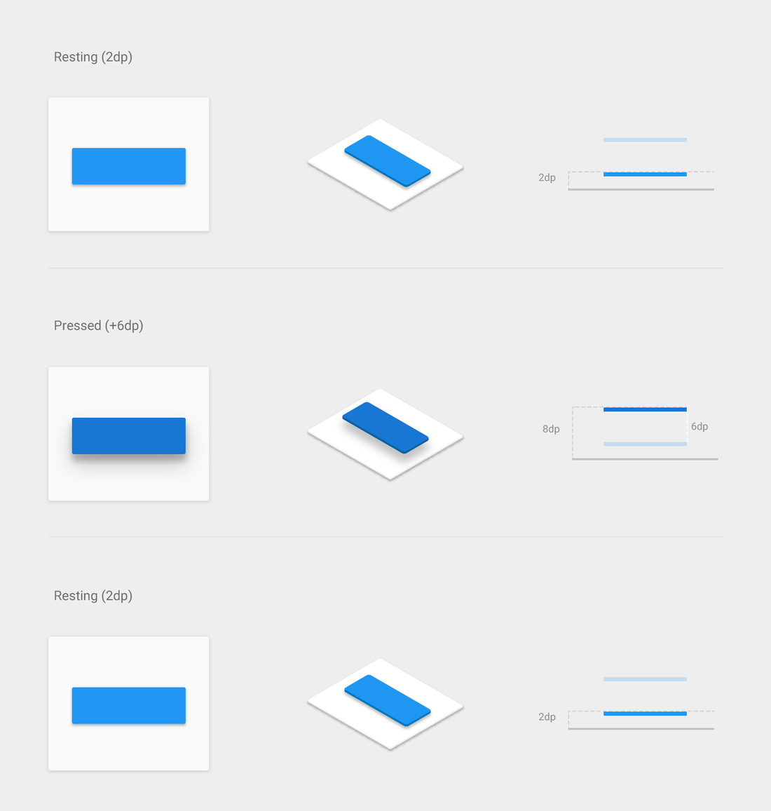
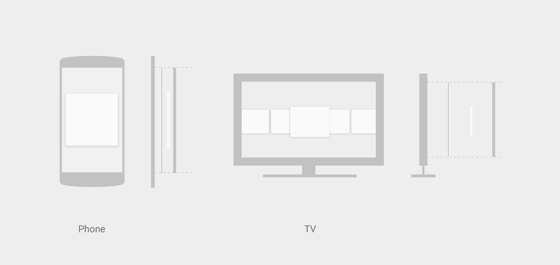
The resting elevation for a given component type is consistent across apps throughout a platform. However, that same component type may have different resting elevations from platform to platform depending on the depth of the environment (e.g., TV has a greater depth than mobile or desktop).
UI STRUCTURES
Material design uses fundamental tools that have come from the world of print design, like baseline grids and a common set of structural grids that work across various pages. The layout is designed to scale across different screen sizes and will help facilitate UI development and ultimately help developer create scalable apps.
The layout guidelines also encourage apps to have a consistent look and feel by using the same visual elements, structural grids, and general spacing rules across platforms and screen sizes. Structural and visual consistency creates an environment for the user that is recognizable across products, which provides users with a high level of familiarity and comfort. Toolbars and larger color blocks should use the primary 500 color, which should be the main color of your app.
COLOURS
Bold use of color in large fields and in the UI is encouraged. Different elements in the UI can take on different parts of your color theme.
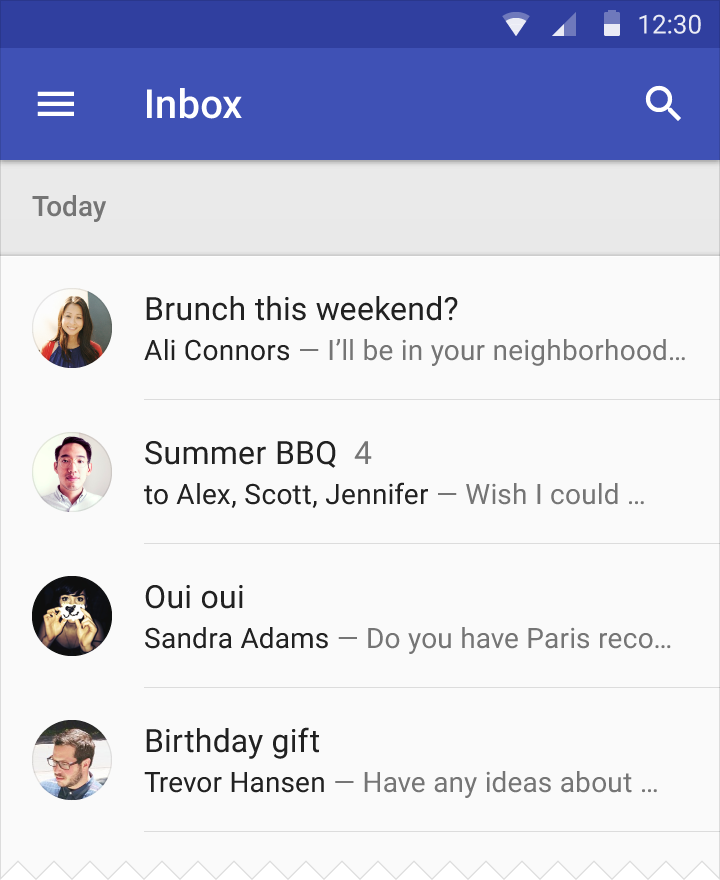 |  |
PAPER TOOLBARS
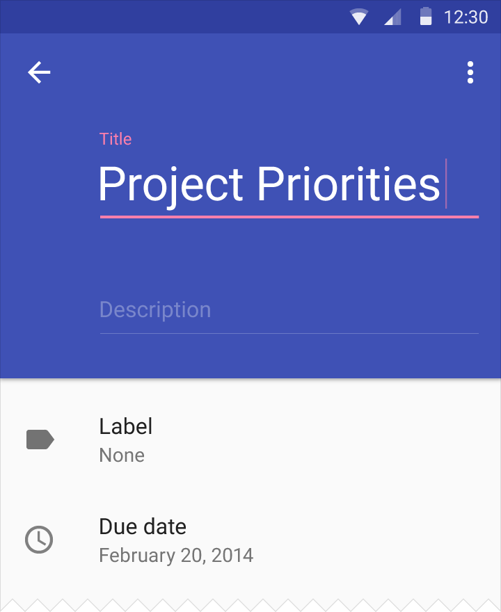
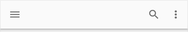
A toolbar is a strip of paper used to present actions. The actions cluster on either side of the toolbar. Navigation actions, such as a drawer menu icon or an up arrow, appear at the left, while contextual actions appear at the right.
A toolbar is a strip of paper used to present actions. The actions cluster on either side of the toolbar. Navigation actions, such as a drawer menu icon or an up arrow, appear at the left, while contextual actions appear at the right.
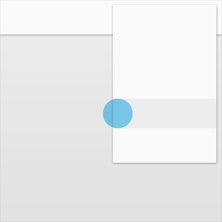
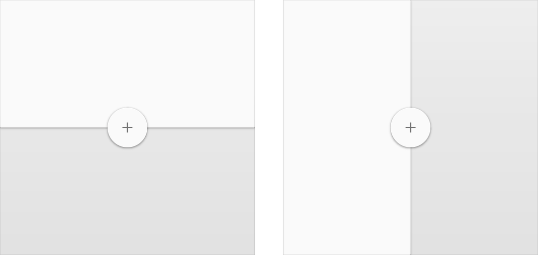
FLOATING ACTIONS
A floating action is a circular sheet of paper separate from a toolbar.
A floating action represents a single promoted action. A floating action can straddle a step if it relates to the content of the paper creating that step.
A floating action is a circular sheet of paper separate from a toolbar.
A floating action represents a single promoted action. A floating action can straddle a step if it relates to the content of the paper creating that step.
ACCENT COLOUR
Use the accent color for your primary action button and components like switches or sliders.
Use the accent color for your primary action button and components like switches or sliders.
  DO Only use the accent color for body text to accent a web link. 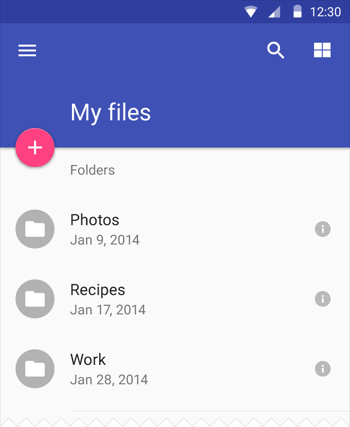 DO |   DON'T Don’t use the accent color for body text colour. 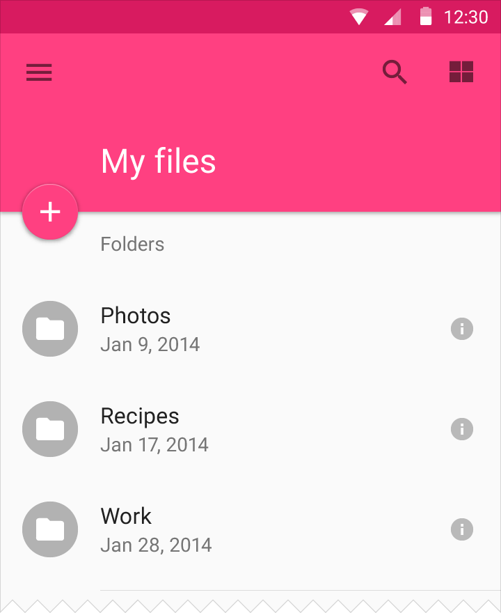 DON'T Don’t use the accent color for app bars or larger areas of color. Avoid using the same color for the floating action button and the background. |
PRODUCT ICONS
Product icons are the visual expression of a brand’s products, services, and tools. Simple, bold, and friendly, they communicate the core idea and intent of a product. While each product icon is visually distinct, all product icons for a given brand should be unified through concept and execution.
Product icons are an essential vehicle for communicating your brand. Using these guidelines as a starting point, make sure your product icon colors and other key elements reflect your brand identity.
DESIGN APPROACH
Product icon design is inspired by the tactile and physical quality of material. Each icon is cut, folded, and lit as paper would be, but represented by simple graphic elements. The quality of the material is sturdy, with clean folds and crisp edges. The matte-like finish interacts with light through subtle highlights and consistent shadows.
 PHYSICAL PROTOTYPE | 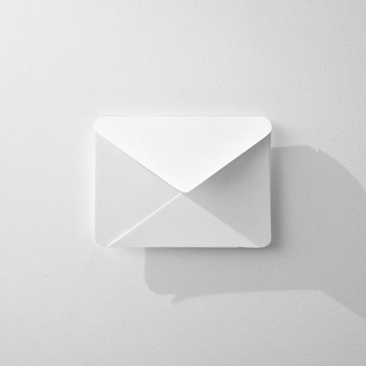 LIGHTING STUDY | 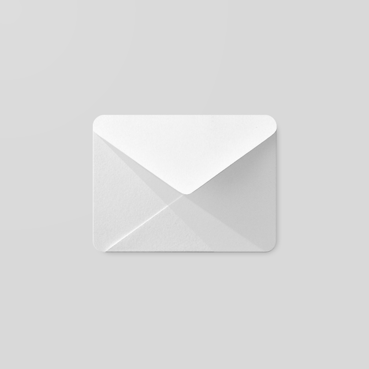 MATERIAL PROTOTYPE |  COLOUR STUDY |
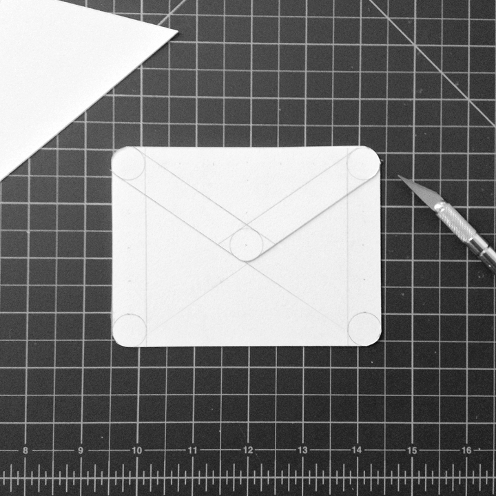
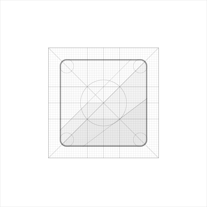
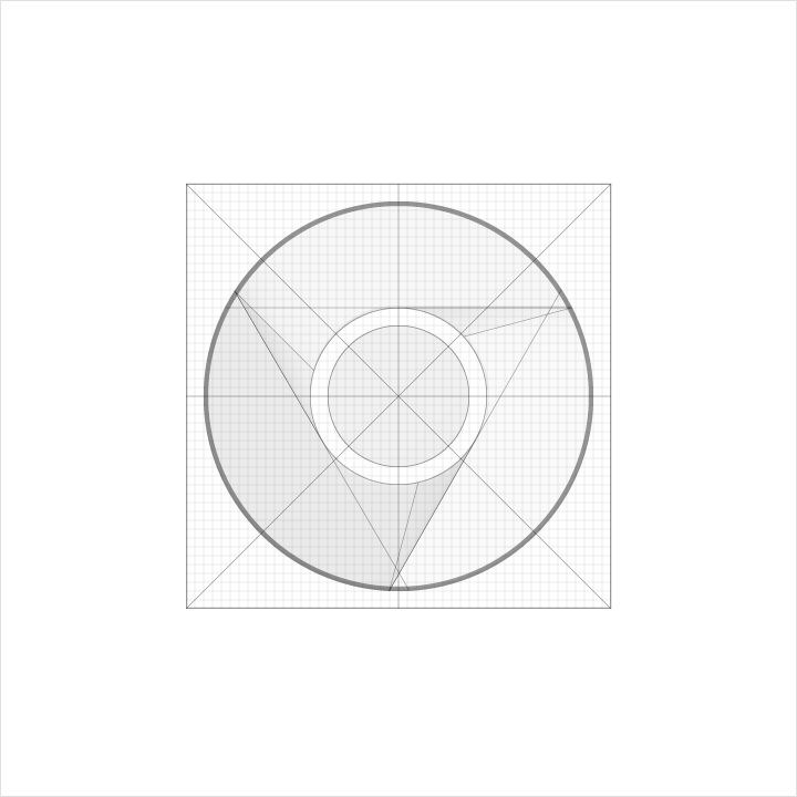
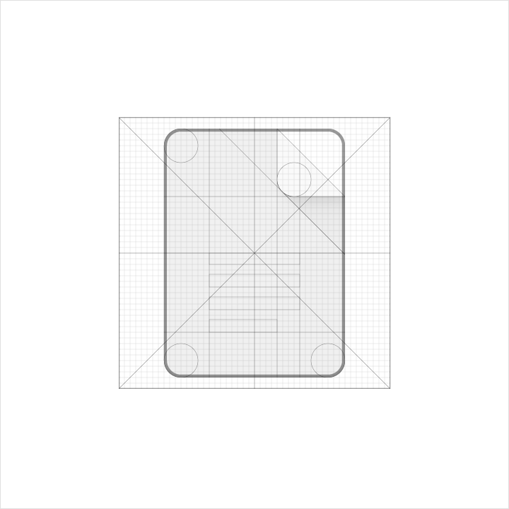
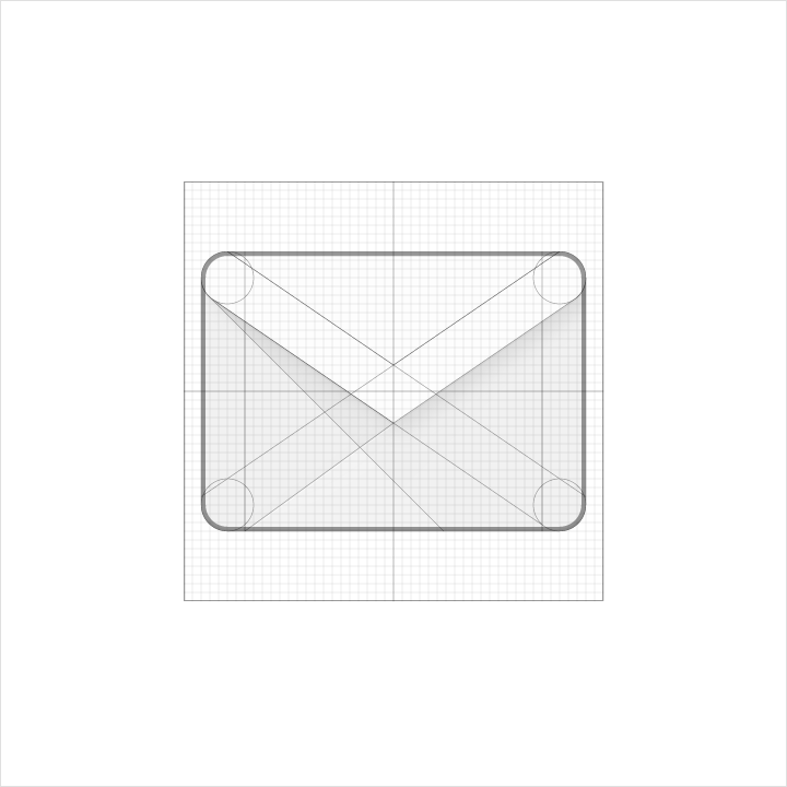
GEOMETRY
Preset standards have been determined for specific keylines: circle, square, rectangle, orthogonals, and diagonals. This small palette of universal and simple elements has been developed to unify product icons and systemize their placement on the grid.
Preset standards have been determined for specific keylines: circle, square, rectangle, orthogonals, and diagonals. This small palette of universal and simple elements has been developed to unify product icons and systemize their placement on the grid.
 |  |  |  |
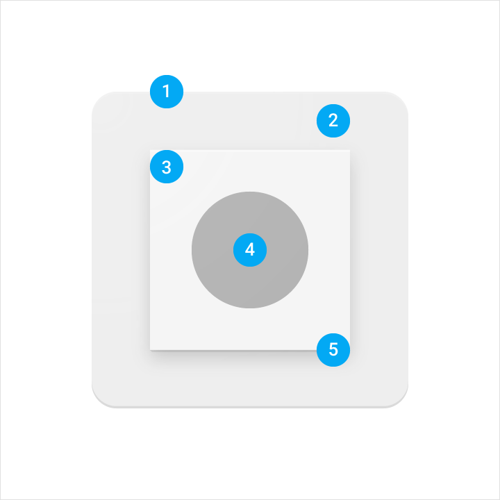
PRODUCT ICON ANATOMY
Product icon anatomy describes the graphic elements that make up a product icon. The consistency of these elements across icons for a given brand is critical in maintaining a shared visual language. Familiarity with these elements makes it easier to understand characteristics of each logo and subtle differences between them. It will also help educate your eye to recognize the underlying structure of logo designs.
1. Finish
2. Material background
3. Material foreground
4. Color
5. Shadow
 COMPONENTS Each component is positioned on top of the previous one, always viewed from straight above.
| 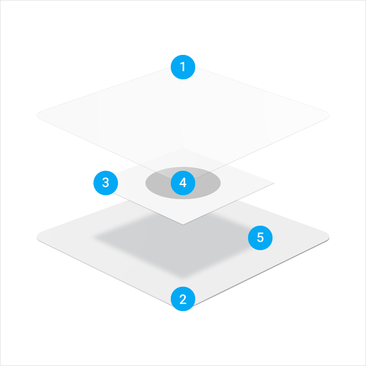 CONSTRUCTION PERSPECTIVE An exploded perspective example illustrating the context of each component of the logo construction.
|

PRODUCT ICON PATTERNS
Influenced by the behavior of physical material, simple conventions provide a sense of surface and tactility. The interactions of material and color allow for numerous unique compositions.
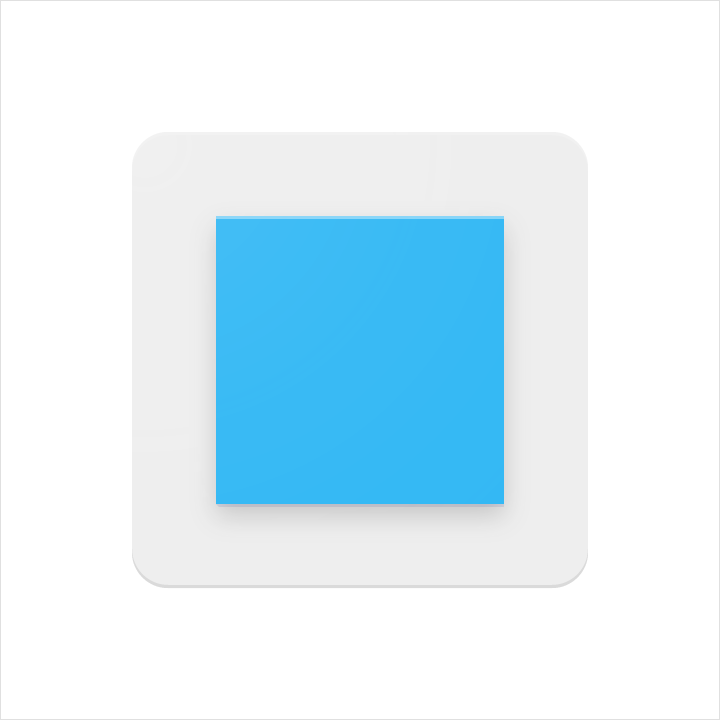
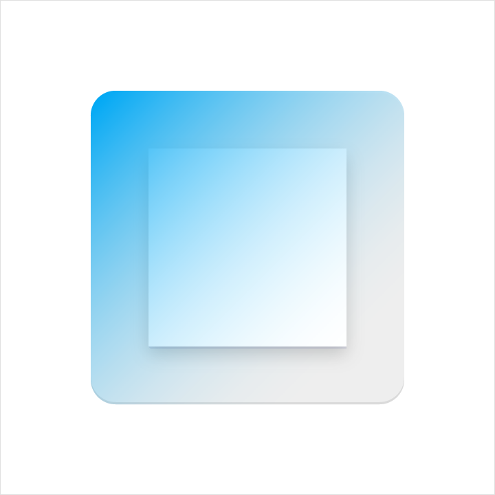
COLOURS
Color elements are flush to the paper’s surface.
Don’t embellish colour elements with any edges or shadows.
Influenced by the behavior of physical material, simple conventions provide a sense of surface and tactility. The interactions of material and color allow for numerous unique compositions.
COLOURS
Color elements are flush to the paper’s surface.
Don’t embellish colour elements with any edges or shadows.
 DO | 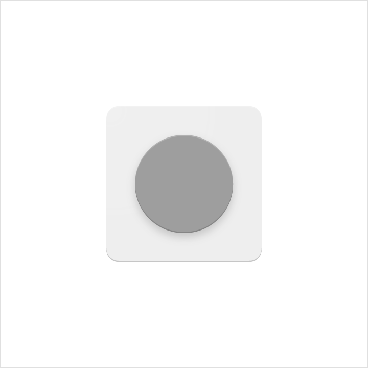 DON'T |
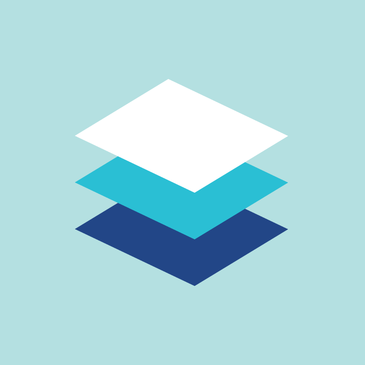
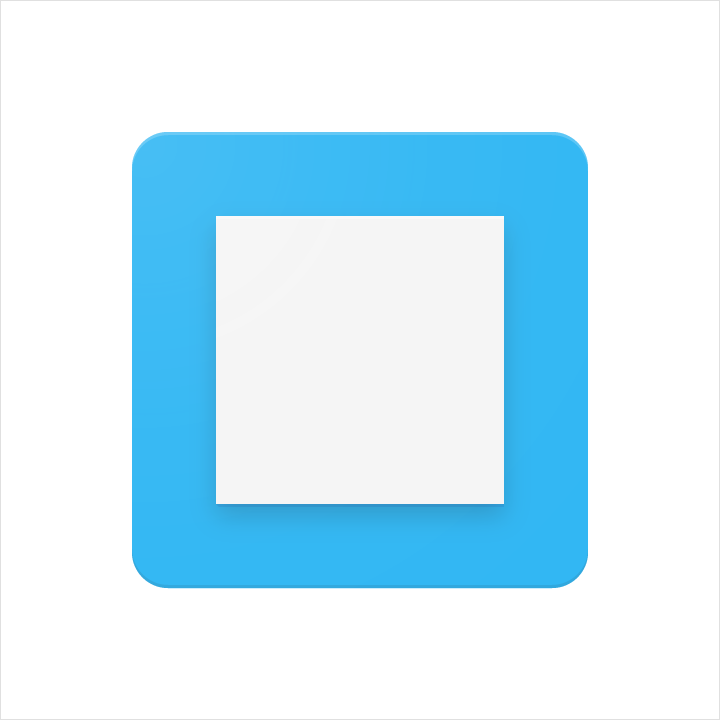
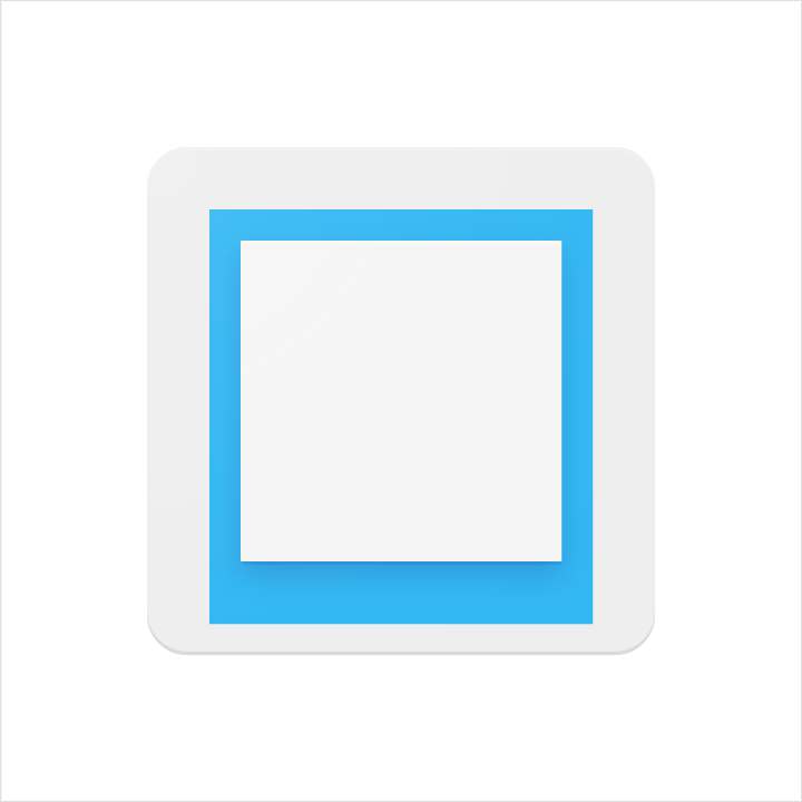
LAYER
Layered paper elements create depth, having edges and shadows.
Don’t exceed more than two layers. Having too many complicates the icon and lacks focus.
Layered paper elements create depth, having edges and shadows.
Don’t exceed more than two layers. Having too many complicates the icon and lacks focus.
 DO |  DON'T |
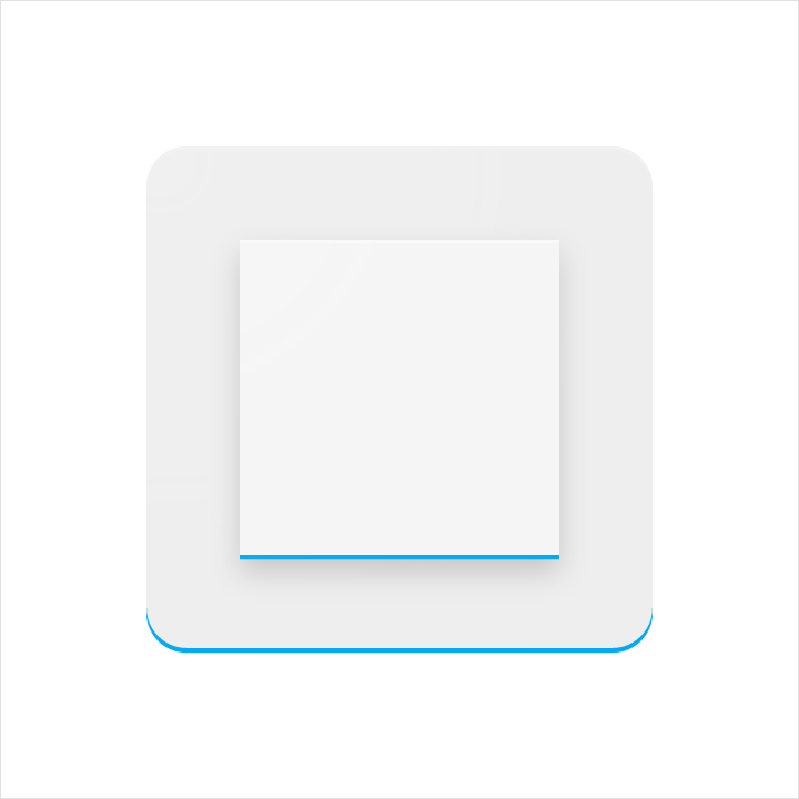
DOG EAR :)
A folder corner, or dog-ear, is used with forms associated with documents or traditional paper-based metaphors.
Don’t use a dog-ear treatment in the upper-left of an icon. The cast shadow from this position interrupts the harmony of the icon.
A folder corner, or dog-ear, is used with forms associated with documents or traditional paper-based metaphors.
Don’t use a dog-ear treatment in the upper-left of an icon. The cast shadow from this position interrupts the harmony of the icon.
 DO |  DON'T |
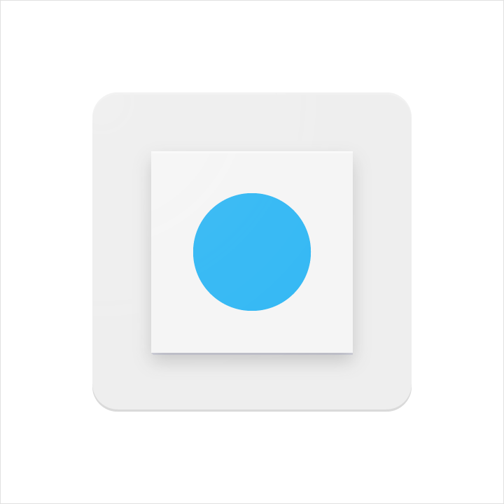
ELEVATE
Elevating a key material element atop a simple background silhouette focuses attention to the center.
Don’t crop elevated material elements within another shape.
Elevating a key material element atop a simple background silhouette focuses attention to the center.
Don’t crop elevated material elements within another shape.
 DO | 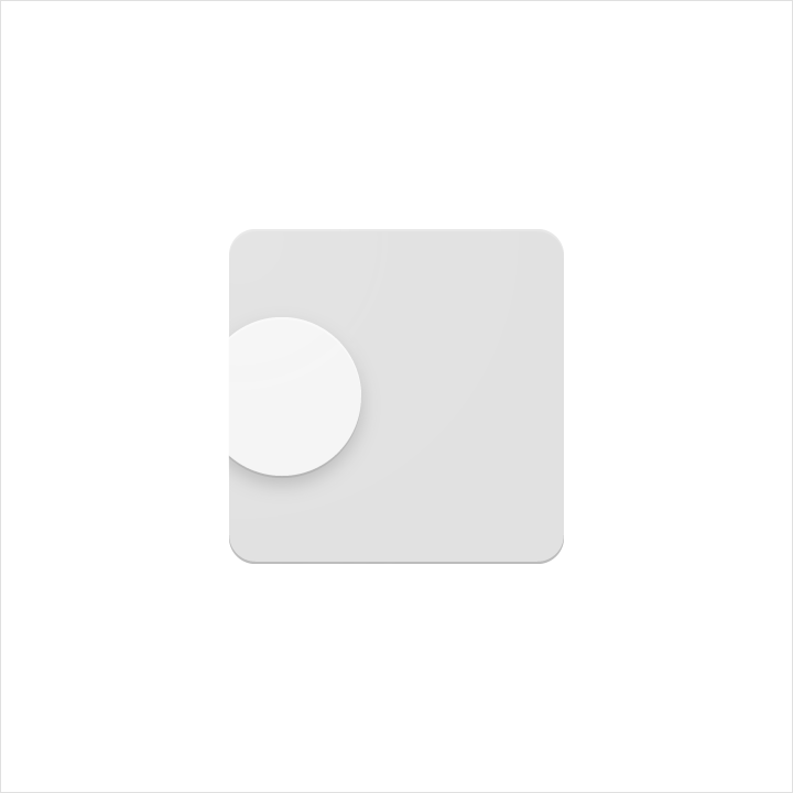 DON'T |
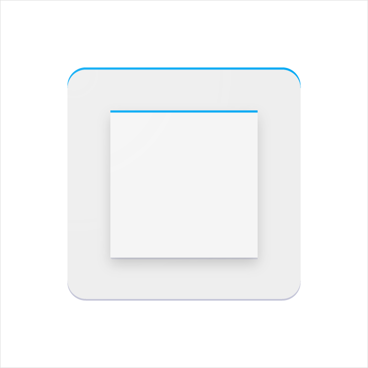
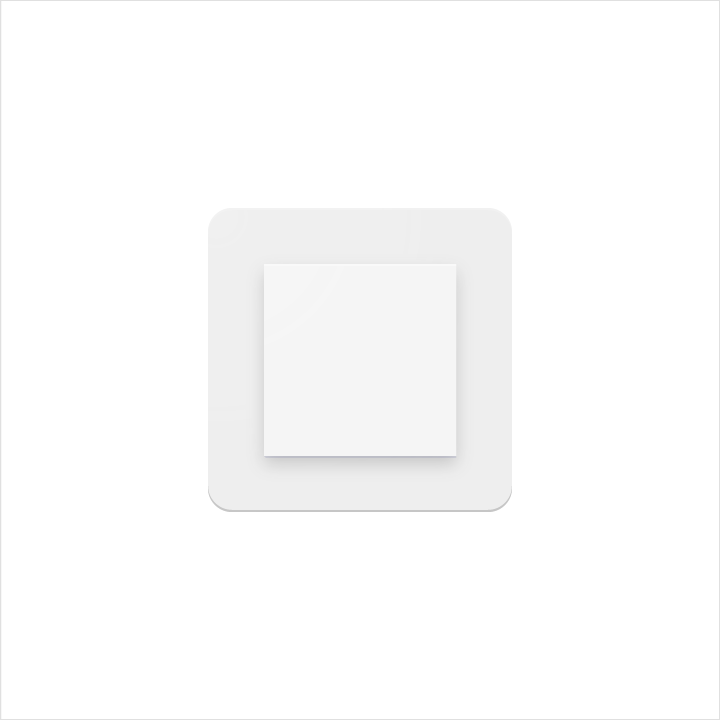
SCORE
Scored material elements have the illusion of depth without losing their geometric form. Scores should be centered on symmetrical shapes.
Don’t use multiple scores, or position a score off-center.
Scored material elements have the illusion of depth without losing their geometric form. Scores should be centered on symmetrical shapes.
Don’t use multiple scores, or position a score off-center.
 DO |  DON'T |
FOLD
Folded material elements are skewed, having greater dimension. Spot colors should be avoided, so as to avoid altering or misrepresenting key elements.
Folded material elements are skewed, having greater dimension. Spot colors should be avoided, so as to avoid altering or misrepresenting key elements.
 DO | 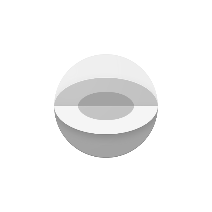 DON'T |
OVERLAP
Overlapped material elements create unique silhouettes. All elements, edges, and shadows are confined to the interior of the silhouette.
Don’t exceed more than two overlaps. Having too many complicates the icon and lacks focus.
Overlapped material elements create unique silhouettes. All elements, edges, and shadows are confined to the interior of the silhouette.
Don’t exceed more than two overlaps. Having too many complicates the icon and lacks focus.
 DO |  DON'T |
ACCORDION
Accordion folded material elements are adjoined by a connecting fold, used to add dimension to a single material element.
Don’t exceed more than two accordion folds. Having too many complicates the icon and lacks focus.
Accordion folded material elements are adjoined by a connecting fold, used to add dimension to a single material element.
Don’t exceed more than two accordion folds. Having too many complicates the icon and lacks focus.
 DO |  DON'T |
DISTORT
Product icons should never be distorted or transformed. Elements should remain in their geometric form, and not be skewed, rotated, bowed, warped, or bent.
Product icons should never be distorted or transformed. Elements should remain in their geometric form, and not be skewed, rotated, bowed, warped, or bent.
 DON'T |  DON'T |
